CSS Gradient Generator
Create linear & radial gradients and get ready‑to‑use CSS code
Mastering CSS Gradients: A Deep Dive with Our Online Generator
In the ever-evolving world of web design, the details are what truly set a website apart. While solid-color backgrounds and flat designs have their place, modern web users are drawn to visuals that are dynamic, seamless, and performant. This is where CSS gradients come into the spotlight, offering a powerful way to add depth, color, and visual flair to your designs without relying on bulky image files.
Coding CSS gradients by hand can be a complex and time-consuming process, especially when you need to experiment with different colors, angles, or stop points. This is precisely why we’ve built our CSS Gradient Generator. It’s a powerful tool designed to take the guesswork out of the process, allowing you to create beautiful, ready-to-use CSS code in seconds.
This comprehensive guide will walk you through everything you need to know about CSS gradients. We’ll start with the basics, move on to a step-by-step guide for using our tool, and then dive into advanced techniques that will help you unlock the full creative potential of gradients in your projects.
What is a CSS Gradient?
At its core, a CSS gradient is not an image file like a JPG or PNG. Instead, it’s a special type of “image” defined entirely by code. The browser uses this code to generate a smooth transition between two or more colors. Because it’s pure code, a CSS gradient has a few incredible advantages:
- Zero File Size: Gradients don’t require downloading a separate file, which means your website will load faster and consume less bandwidth.
- Scalability: They are vector-based, which means they look perfectly sharp and clear on any screen size and resolution, from the smallest smartphone to the largest 4K display, without any pixelation.
- Flexibility: You can easily change the colors, direction, or style of a gradient with a few quick edits to the code.
Simply put, a CSS gradient is an instruction you give to the browser: “Start with this color, transition to that color, and do it in this direction.” This instruction is handled by CSS functions like linear-gradient(), radial-gradient(), and conic-gradient().
Understanding the Three Main Types of Gradients
While your generator focuses on linear gradients, understanding all three types will broaden your design possibilities.
1. Linear Gradients
This is the most common and straightforward type of gradient. It creates a smooth color transition along a straight line. You can control the angle of this line, which determines the direction of the color change.
The basic syntax for a linear gradient is:
linear-gradient(direction or angle, color-start, color-end);
- Direction: You can use keywords like
to top,to bottom,to left, orto right. For example,linear-gradient(to right, red, yellow)creates a horizontal gradient from red to yellow. - Angle: You can use a degree value, which provides much more control.
0degcreates a gradient from bottom to top,90degfrom left to right,180degfrom top to bottom, and270degfrom right to left. Our tool uses a degree slider for this reason—it gives you precise control over the exact angle. Angles like45degor135degare perfect for creating dynamic diagonal gradients that add a lot of visual interest.
2. Radial Gradients
Unlike linear gradients that move along a line, radial gradients radiate outwards from a central point in a circular or elliptical pattern. They are perfect for creating soft, glowing, or spotlight-like effects.
The basic syntax for a radial gradient is:
radial-gradient(shape size at position, color-start, color-end);
- Shape: The shape can be
circleorellipse. - Size: You can use keywords like
farthest-corner(the default),closest-side,farthest-side, orclosest-corner. You can also use pixel or percentage values. - Position: You can specify where the center of the gradient should be, using keywords like
at center,at top left, or coordinates likeat 50px 50px.
3. Conic Gradients
Conic gradients rotate around a central point, much like the hands of a clock. They are incredibly useful for creating pie charts, radial-like patterns, and other unique designs.
The basic syntax for a conic gradient is:
conic-gradient(from angle at position, color-start, color-stop, …);
from angle: This sets the starting angle of the gradient.at position: This sets the center point of the gradient.- Color Stops: You can define multiple color stops to create a full color wheel or a specific pattern.
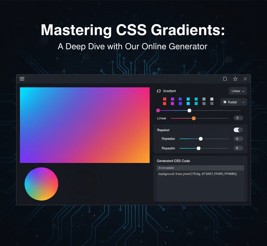
How to Use Our Generator: A Step-by-Step Guide
Our tool is designed to make creating beautiful linear gradients incredibly easy, even if you’ve never written a line of code before. Here’s a simple guide to get you started.
Step 1: Select Your Primary Colors
The first step is to choose the two primary colors for your gradient. The tool provides two color pickers for this purpose.
- Click on the first color picker to open a color palette. This will be the starting color of your gradient. Choose a light or dark color that will serve as the foundation of your design.
- Click on the second color picker to choose the ending color. This is the color your gradient will transition into.
As soon as you select a color, the gradient preview box will update in real-time. This live feedback is a key feature of our tool, allowing you to quickly iterate through different color combinations to find the perfect blend. Try selecting a cool color like a deep blue and a warm color like a fiery orange to see a dramatic and beautiful transition.
Step 2: Adjust the Direction with Precision
The “Direction” slider is where you control the angle of your linear gradient. This powerful slider gives you full control from 0 to 360 degrees.
- Drag the slider to the left or right, and watch the gradient preview change its angle instantly.
- For a classic horizontal gradient, set the angle to 90 degrees.
- For a simple vertical gradient, set the angle to 180 degrees.
- Want to add more dynamism? Try an angle like 45 degrees or 135 degrees to create a diagonal line that adds energy to your design.
The real-time updates make it simple to find the perfect angle that complements your color choice. The numeric value next to the slider always shows you the precise angle you’ve selected, which is helpful for recreating the effect in another project.
Step 3: Copy the Ready-to-Use Code
Once you are satisfied with your colors and direction, the generated CSS code will be displayed automatically in the box below the preview. This code is what you’ll use in your project.
Simply click the “Copy Code” button. A small confirmation message will appear to let you know the code has been successfully copied to your clipboard.
The code will look something like this:
background: linear-gradient(90deg, #00c6ff, #0072ff);
You can then paste this line of code directly into your stylesheet (.css file) to apply it to any element on your website. For example, to apply it to your website’s body, you would write:
body {
  background: linear-gradient(90deg, #00c6ff, #0072ff);
}
This single line of code replaces the need for a separate image file, ensuring your site remains fast and responsive.
Beyond the Basics: Advanced CSS Gradient Techniques
Our generator provides a solid foundation, but the true power of gradients lies in their advanced capabilities. Once you’ve copied the basic code, you can easily modify it to create more complex and exciting effects.
Adding Multiple Color Stops
A gradient doesn’t have to be a transition between just two colors. You can add as many color stops as you like. To do this, simply add more colors to your generated code, separated by commas.
For example, to create a three-color gradient from red to yellow to blue, you would modify the code like this:
background: linear-gradient(90deg, #ff0000, #ffff00, #0000ff);
Creating Sharp Transitions with Color Stop Percentages
By default, the browser smoothly transitions between colors. But what if you want a sharp, distinct line? You can achieve this by using percentage values after each color to define where the color should stop.
For example, to create a two-toned background with a crisp vertical line in the middle:
background: linear-gradient(90deg, #ff0000 50%, #ffff00 50%);
In this code, the red color fills up to the 50% mark, and the yellow color begins immediately at the 50% mark, creating a hard stop instead of a blend.
Adding Transparency with RGBA and HSLA
Gradients can be semi-transparent, which is perfect for creating overlays on top of images or other elements. To do this, you’ll need to use the rgba() or hsla() color functions, which include an alpha (transparency) channel.
rgba():linear-gradient(45deg, rgba(255, 0, 0, 0.5), rgba(0, 0, 255, 0.8));- Here, the first color is a semi-transparent red (50% opaque), and the second is a mostly opaque blue (80% opaque).
hsla(): This is similar but uses Hue, Saturation, and Lightness, which can sometimes be more intuitive for designers.
The Power of Repeating Gradients
If you want to create a pattern or a striped effect, you can use repeating-linear-gradient(). This function takes the same arguments as linear-gradient() but repeats the color pattern indefinitely.
For example, to create a set of diagonal stripes:
background: repeating-linear-gradient(45deg, #f06, #f06 10px, #39f 10px, #39f 20px);
This creates a pattern of 10-pixel wide stripes that repeat across the element.
Combining Multiple Gradients
One of the most powerful features of CSS backgrounds is the ability to layer multiple gradients on top of each other, separated by a comma.
For example, you can create a radial gradient on top of a linear gradient to produce a unique effect:
background: radial-gradient(circle, #ff0000, transparent), linear-gradient(90deg, #00c6ff, #0072ff);
The first gradient (radial) will sit on top of the second (linear), with the transparent parts revealing the layer below.
Real-World Use Cases for Gradients
Now that you know how to use the generator and how to modify the code, let’s explore some of the most popular ways to use gradients in your designs.
1. Hero Sections and Full-Page Backgrounds
A full-screen gradient background is a fantastic way to make a strong visual statement on your homepage. It adds vibrancy and depth, immediately captivating your visitors. You can use bold, contrasting colors or a subtle, monochromatic blend for a more minimalist look.
2. Buttons and UI Elements
Instead of a flat background color, give your buttons a subtle gradient. A slight change from a darker shade to a lighter one can make a button look more three-dimensional and clickable, adding a touch of polish and premium feel to your user interface.
3. Text Effects
You can apply a gradient directly to text for a unique and eye-catching heading or title. This requires a few lines of additional CSS:
h1 {
  background: linear-gradient(45deg, #ff00c6, #9028a3);
  -webkit-background-clip: text;
  -webkit-text-fill-color: transparent;
}
This creates a dynamic text effect that is fully scalable and looks great on any screen.
4. Image Overlays
Often, an image background can make text hard to read. A semi-transparent gradient overlay solves this problem beautifully. You can use a dark-to-transparent gradient to darken the bottom of an image, ensuring that white text placed over it is legible.
5. Animated Gradients
For a truly mesmerizing effect, you can animate a gradient using CSS @keyframes. This involves changing the angle or position of the gradient over a period of time, creating a subtle, shifting background that adds a high level of sophistication to your design.
@keyframes gradient-animation {
  0% { background-position: 0% 50%; }
  50% { background-position: 100% 50%; }
  100% { background-position: 0% 50%; }
}

.element {
  background: linear-gradient(270deg, #00c6ff, #0072ff);
  background-size: 400% 400%;
  animation: gradient-animation 15s ease infinite;
}
This code makes the gradient color blend slowly shift back and forth, providing a calming and engaging background.
The Benefits of Using a Generator vs. Manual Coding
While coding gradients by hand gives you ultimate control, a generator offers distinct advantages for both beginners and seasoned professionals.
- Saves Time: You can create and test hundreds of color and angle combinations in a fraction of the time it would take to manually write and re-write the CSS code.
- Reduces Errors: The code generated is always syntactically correct, eliminating the risk of typos that can break your design.
- Empowers Creativity: The visual feedback loop allows for rapid experimentation. You can play with different colors and angles without worrying about the code, letting your creativity flow freely.
- Acts as a Learning Tool: For newcomers to web development, the generator provides a clear, visual way to understand how CSS properties like
angleandcolor stopsaffect the final output. You can use it as a sandbox to learn how gradients work before diving into the code yourself.
Conclusion
CSS gradients are a foundational element of modern web design, offering endless possibilities for adding visual interest and depth to your projects. They are efficient, scalable, and incredibly versatile.
Our CSS Gradient Generator is your perfect starting point, simplifying a complex process into a few clicks. It’s designed to save you time, eliminate frustration, and spark your creativity. Whether you’re building a new hero section, designing a dynamic button, or just playing around with colors, this tool will help you achieve stunning results.
So, go ahead and give it a try. Pick your colors, set your direction, and watch your design transform right before your eyes. Happy coding!
Govts.cloud Latest News