In the fast-paced world of web design, the visual elements that capture a user’s attention matter more than ever. While solid colors have their place, modern designers and developers are turning to a more dynamic, elegant, and efficient solution: CSS gradients. These seamless color transitions are not just visually appealing; they are also a cornerstone of high-performance web development.
Free CSS Gradient Generator
But let’s be honest—creating a perfect gradient manually can be frustrating. You find yourself battling with syntax, guessing angles, and endlessly tweaking color values. The trial-and-error process is time-consuming and can stifle your creative flow.
What if there was a better way? A tool that lets you visualize your gradient in real-time, instantly generate the perfect code, and empower you to create stunning backgrounds in seconds?
This is where our Free Online CSS Gradient Generator comes in.
This comprehensive guide will not only show you how to use this powerful tool but also provide an in-depth exploration of CSS gradients. By the end of this article, you will be able to:
- Understand the fundamental principles of CSS gradients.
- Distinguish between linear, radial, and conic gradients.
- Master advanced techniques like multi-color stops, transparency, and animation.
- Apply gradients to your website for professional, eye-catching results.
- And most importantly, you’ll be ready to try our tool and create your first gradient in under a minute.
What Exactly is a CSS Gradient? The Ultimate Performance Hack
At its core, a CSS gradient is not an image file. It’s a special type of “image” defined entirely by a few lines of CSS code. This key distinction provides several game-changing advantages for your website:
- Zero File Size: Gradients are rendered by the browser based on code, so there’s no bulky image file to download. This dramatically reduces page load times, which is critical for user experience and search engine optimization (SEO).
- Perfect Scalability: Since they are vector-based, gradients look incredibly sharp on any device, from a small smartphone to a massive 4K display. You’ll never have to worry about pixelation.
- Complete Flexibility: You can easily change a gradient’s colors, angle, or style with a simple code edit, allowing for rapid design iteration.
Think of a gradient as an instruction you give to the browser: “Start at this point with this color, and smoothly transition to that color at this other point.”
The Three Main Types of CSS Gradients
While our generator focuses on the most common type, the linear gradient, understanding all three types will unlock a world of creative possibilities.
1. Linear Gradients
This is the most widely used and straightforward gradient. It creates a smooth color transition along a straight line. You have full control over the direction of this line, which you can specify with a keyword or a precise angle in degrees.
- Direction Keywords: You can use simple phrases like
to right,to bottom,to top left, etc. - Angle in Degrees: For ultimate control, you can use a degree value (
0degto360deg). For example,90degcreates a horizontal gradient, and45degcreates a diagonal one. This is the most common and powerful method, and it’s what our generator uses.
2. Radial Gradients
Radial gradients create a smooth color transition that radiates outwards from a central point, like the sun. They are perfect for creating soft, glowing, or spotlight effects.
- Shape: You can choose between
circleorellipse. - Position: You can specify where the center of the gradient should be, using keywords like
at centeror coordinates.
3. Conic Gradients
Conic gradients rotate around a central point, much like the hands of a clock. They are ideal for creating a variety of unique patterns, including pie charts and color wheels, and they offer a truly distinct visual style.
- Angle and Position: You can define a starting angle (
from 0deg) and the position of the center point (at center).
The Problem with Manual Gradient Coding (And Why You Need a Generator)
If you’ve ever tried to code a gradient by hand, you know the process can be slow and frustrating. A single typo or an incorrect angle can break the entire effect. You often find yourself:
- Guessing Angles: “Is 45 degrees or 50 degrees better for this diagonal?” Without a visual preview, it’s all guesswork.
- Struggling with Color Codes: Remembering hex codes or RGB values for multiple colors can be a nightmare.
- Fighting Syntax: A missing comma, an extra parenthesis, or a misplaced keyword can lead to a broken gradient.
- Wasting Time: You spend more time troubleshooting code than designing.
This constant friction can kill your creative momentum and make a simple task feel like a chore.
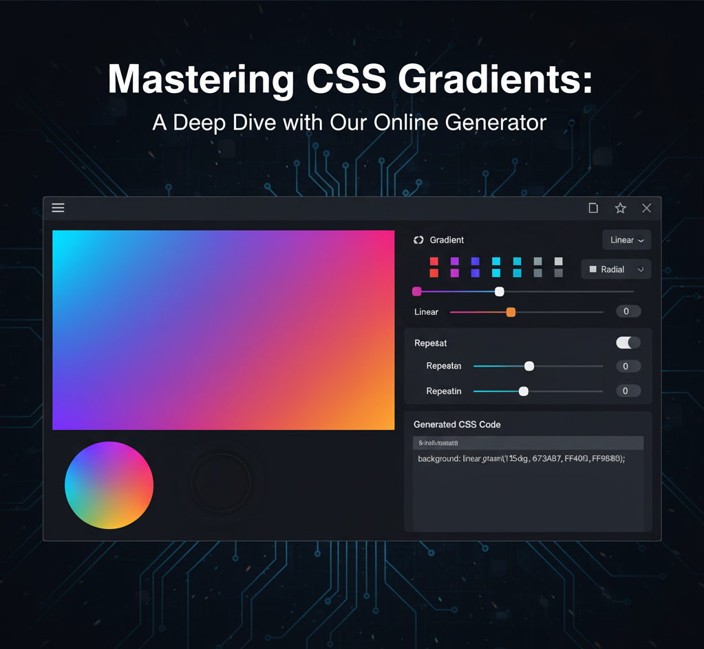
The Solution: A Free Online Tool to Generate Your CSS Gradients Instantly
We built our CSS Gradient Generator to solve these exact problems. It’s an intuitive, easy-to-use tool that lets you design visually and get the code instantly, without having to write a single line yourself.
Here’s how it works in a few simple steps. Go ahead and open the tool in a new tab to follow along: https://imageconverthq.com/css-gradient/
Step 1: Pick Your Colors
The first step is to choose the colors you want to blend. Our tool provides two color pickers for the start and end of your gradient.
- Click on the first color picker to choose your starting color.
- Click on the second color picker to choose the ending color.
As you select new colors, the live preview window will update in real-time. This instant feedback is the key to creating the perfect color combination. Experiment with bold contrasts or subtle, harmonious blends to see the effect immediately.
Step 2: Set the Direction with the Slider
The “Direction” slider is where you control the angle of your linear gradient. This powerful slider gives you full control, from 0 to 360 degrees.
- Drag the slider to the left or right and watch the gradient’s angle change instantly.
- The numeric value next to the slider shows the precise angle in degrees, so you always know exactly what you’re getting.
- Want a classic horizontal look? Set the slider to 90 degrees.
- Looking for a more dynamic, diagonal effect? Try angles like 45deg or 135deg.

The visual feedback makes it easy to find the perfect angle that complements your color choice and fits your design.
Step 3: Copy Your Ready-to-Use CSS Code
Once you are satisfied with your design, the ready-to-use CSS code will appear automatically in the code box below the preview. This code is already formatted and ready for use.
Simply click the “Copy Code” button, and the entire CSS line will be copied to your clipboard. A small confirmation message will pop up to let you know the copy was successful.
The generated code will look something like this:
background: linear-gradient(90deg, #00c6ff, #0072ff);
This single line of code is all you need to add a beautiful gradient to your website.
Beyond the Basics: Advanced Gradient Techniques You Can Create
While our generator provides the basic two-color linear gradient, the world of CSS gradients is much bigger. Once you have the fundamental code, you can easily modify it to create more complex and exciting effects.
1. Creating Multi-Color Gradients
A gradient doesn’t have to be limited to just two colors. You can add as many as you like. Simply add more colors to your generated code, separated by a comma.
Example:
background: linear-gradient(90deg, #ff0000, #ffff00, #0000ff);
This creates a smooth transition from red to yellow to blue.
2. Creating Hard Lines with Color Stops
Do you want a sharp, distinct line instead of a smooth blend? You can achieve this by adding a percentage value after each color to define where the color should stop.
Example:
background: linear-gradient(90deg, #ff0000 50%, #ffff00 50%);
Here, the red fills exactly half the space, and the yellow begins immediately, creating a clean vertical line.
3. Adding Transparency with RGBA
Gradients can be semi-transparent, which is perfect for creating overlays on top of images. Use the rgba() color format, where the last value is the alpha (transparency) channel.
Example:
background: linear-gradient(45deg, rgba(255, 0, 0, 0.5), rgba(0, 0, 255, 0.8));
This gradient transitions from a semi-transparent red to a semi-transparent blue.
4. Combining Multiple Gradients
You can layer multiple gradients on top of each other on a single element. Simply separate the gradient functions with a comma.
Example:
background: radial-gradient(circle, #ff0000, transparent), linear-gradient(90deg, #00c6ff, #0072ff);
In this case, the radial gradient (with its transparent parts) will sit on top of the linear gradient, creating a unique combined effect.
5. Creating Animated Gradients
For a truly mesmerizing effect, you can animate a gradient using CSS @keyframes. This makes the colors slowly shift and move across the background.
@keyframes gradient-animation {
  0% { background-position: 0% 50%; }
  50% { background-position: 100% 50%; }
  100% { background-position: 0% 50%; }
}

.element {
  background: linear-gradient(270deg, #00c6ff, #0072ff);
  background-size: 400% 400%;
  animation: gradient-animation 15s ease infinite;
}
This code makes the gradient color blend slowly shift, providing a calming and engaging background.
How to Use Gradients on Your Website: Real-World Applications
A gradient is more than just a background. It’s a powerful design element that can be used in countless ways.
1. Full-Page Hero Sections
The most common use for a gradient is as a full-screen hero section background. It sets a dynamic and professional tone immediately, without slowing down your page.
2. Buttons and UI Elements
Instead of a flat background, give your buttons a subtle gradient. A slight change from a darker to a lighter shade can make a button feel more three-dimensional and clickable, adding polish to your design.
3. Text Effects
You can apply a gradient directly to text for a unique and eye-catching heading. Use the background-clip: text; property to make your titles pop.
4. Image Overlays
Need to make text readable on top of a busy background image? Use a semi-transparent gradient overlay to add a color filter and ensure your text stands out.
Why Use Our Generator? The Final Verdict
While it’s important to understand the code, our online CSS gradient generator is your secret weapon.
- Saves Time: What would take minutes of manual coding and debugging now takes seconds.
- Eliminates Errors: The code is always perfect, every time.
- Boosts Creativity: The visual, real-time feedback allows you to experiment freely and find new color combinations you might never have thought of.
Ready to Create Your Own Stunning Gradient?
Now that you understand the power of CSS gradients, it’s time to create your own. Stop guessing and start designing.
Head over to https://imageconverthq.com/css-gradient/ to try our free online tool now and create your first gradient in seconds. The future of your web design is just a few clicks away!
2 Responses
Some truly excellent information, Glad I discovered this.
Hello There. I found your blog using msn. This is an extremely well written article. I will make sure to bookmark it and return to read more of your useful information. Thanks for the post. I’ll definitely return.